Guacabilities is an avocado toast bar established on the premise that you can put whatever you want on top of your toast, and build your slice of perfection. With a catalog of options that changes monthly, there are endless combinations to keep customers coming back for more.
But how did I get to this point?
The Brief
Restaurant Name / Guacabilities, Avocado Toast Bar
Tagline / “An Avo-lanche of Options”
Defining Words
Robust / strong and healthy; vigorous.
Playful / fond of games and amusement; lighthearted.
Modern / characterized by or using the most up-to-date techniques, ideas, or equipment.
Conceptual Logos
Developing a logo
Brand identities start not just with. logo but with tenets that you can build on. It's clear this is a restaurant for a specialty item, but what do we want to imprint on our customers? The three words I wanted to be associated with this brand are Robust, modern, and playful.
From there I went about exploring different logo options, finding what was appropriate and most versatile for all the places you would see a restaurant logo: napkins, coasters, menus, storefront signs, advertisements, boxes, etc.
Concept is Key
Maybe a more modest solution than other options, the logo I landed on felt most appropriate while also being filled with a unique voice and concept of the hidden avocado and toast, that perfectly communicated what the restaurant was all about. I did end up adapting the wordmark into a secondary mark for use in tight areas where a 1 x 1 ratio would be more appropriate.
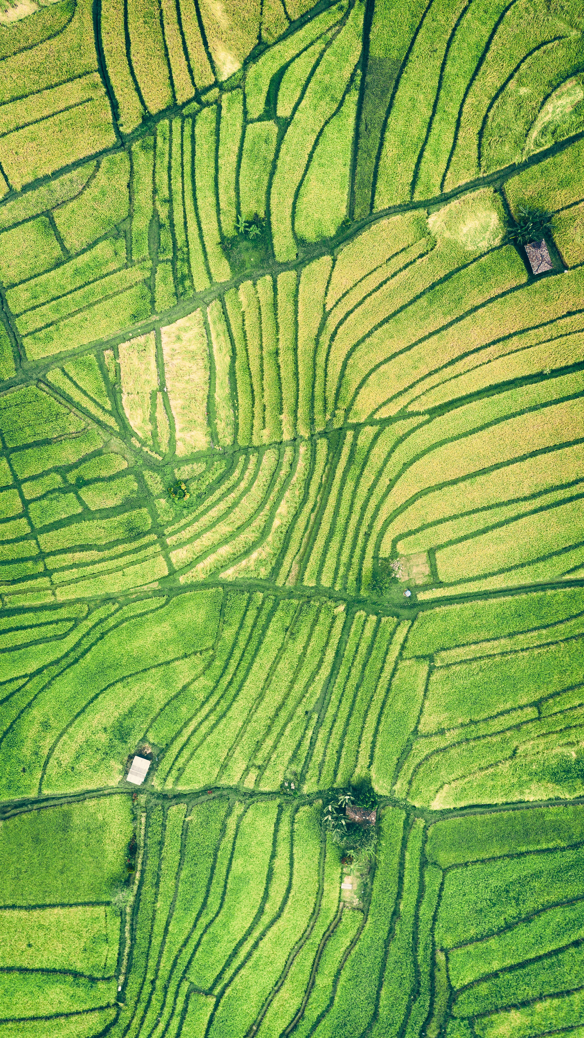

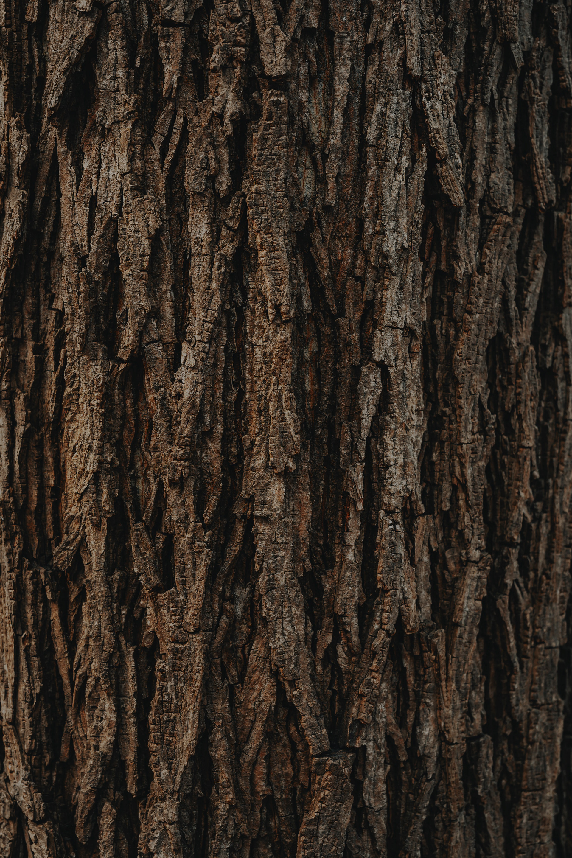
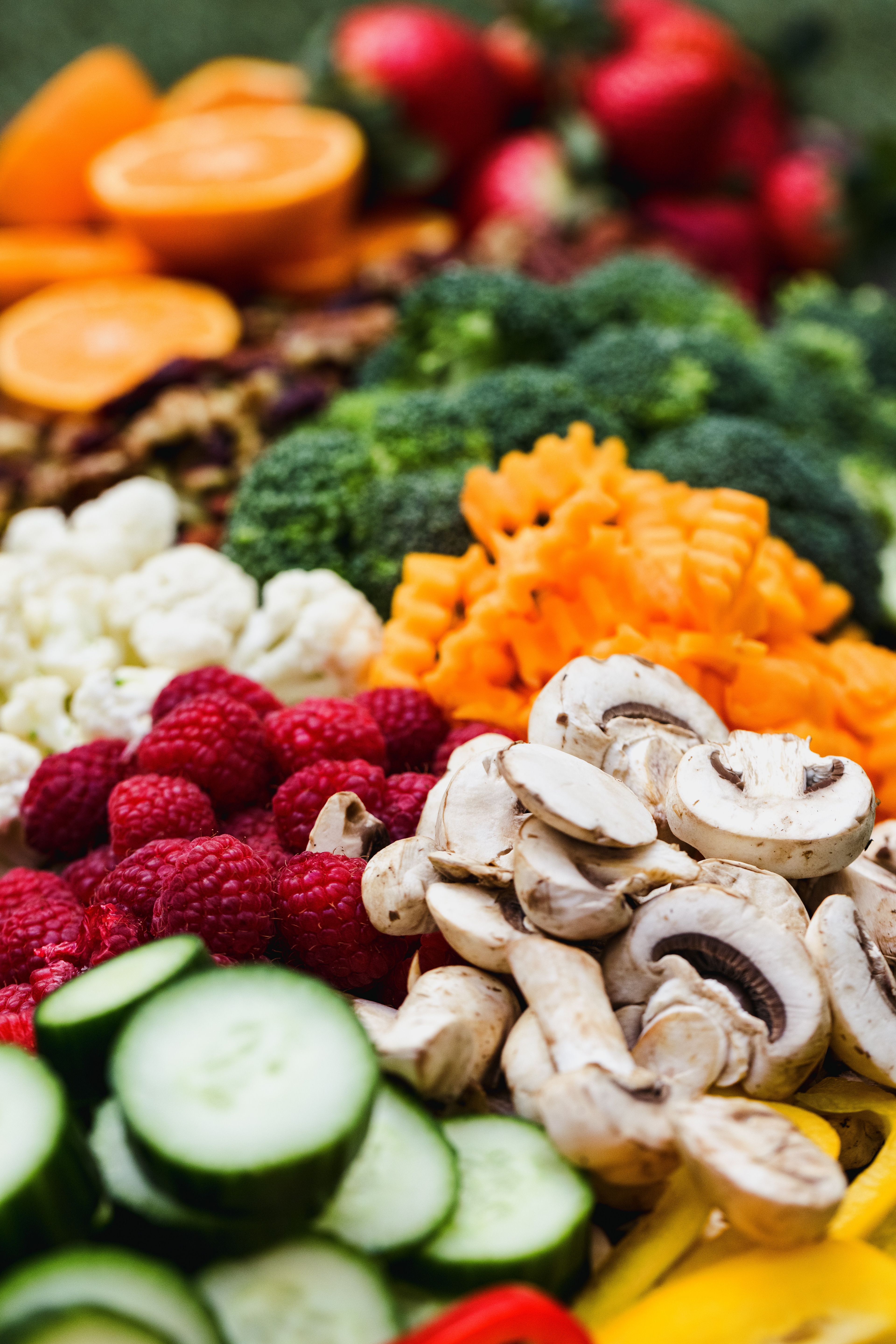
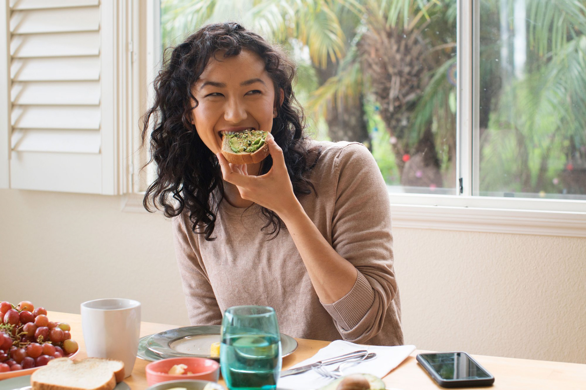
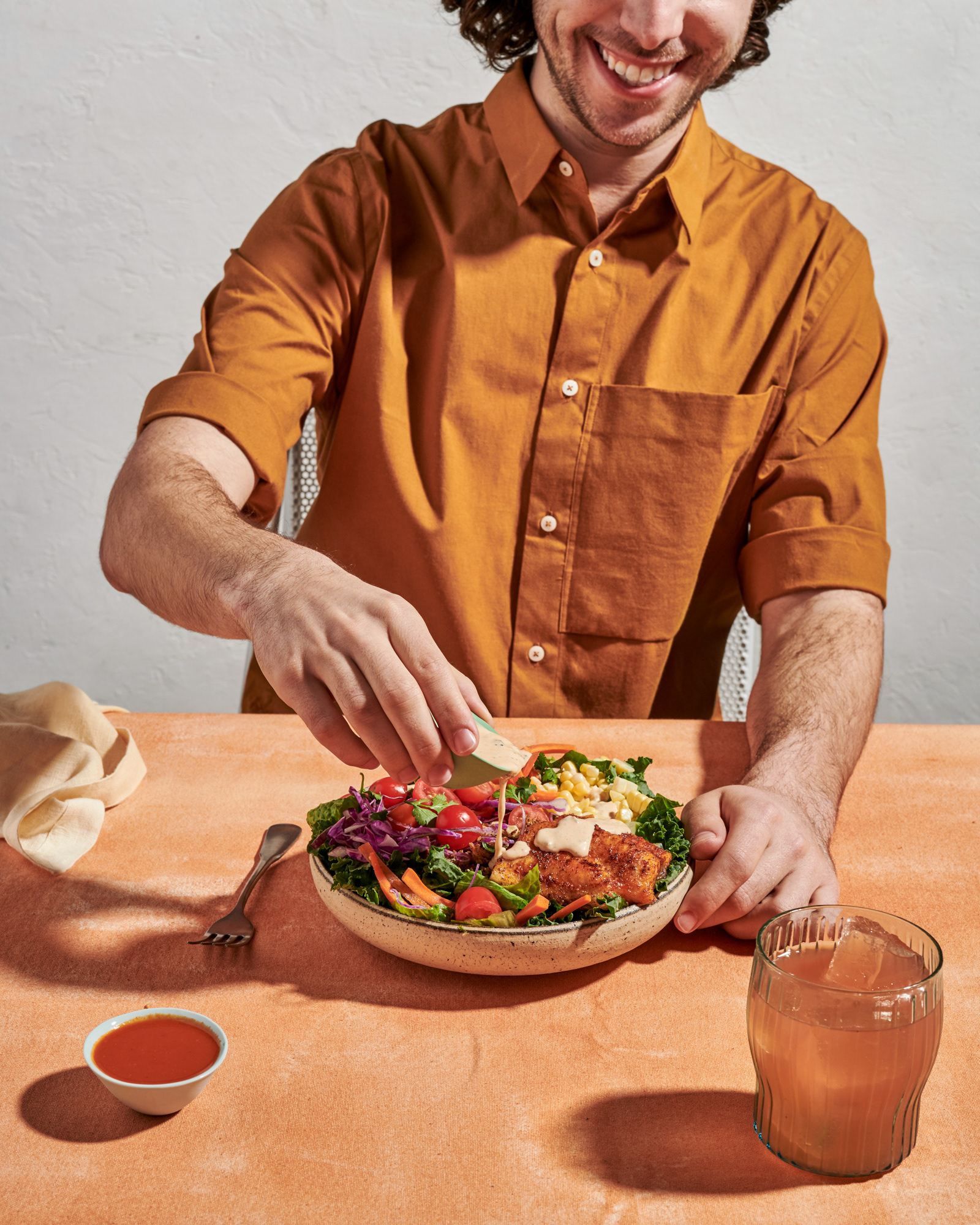
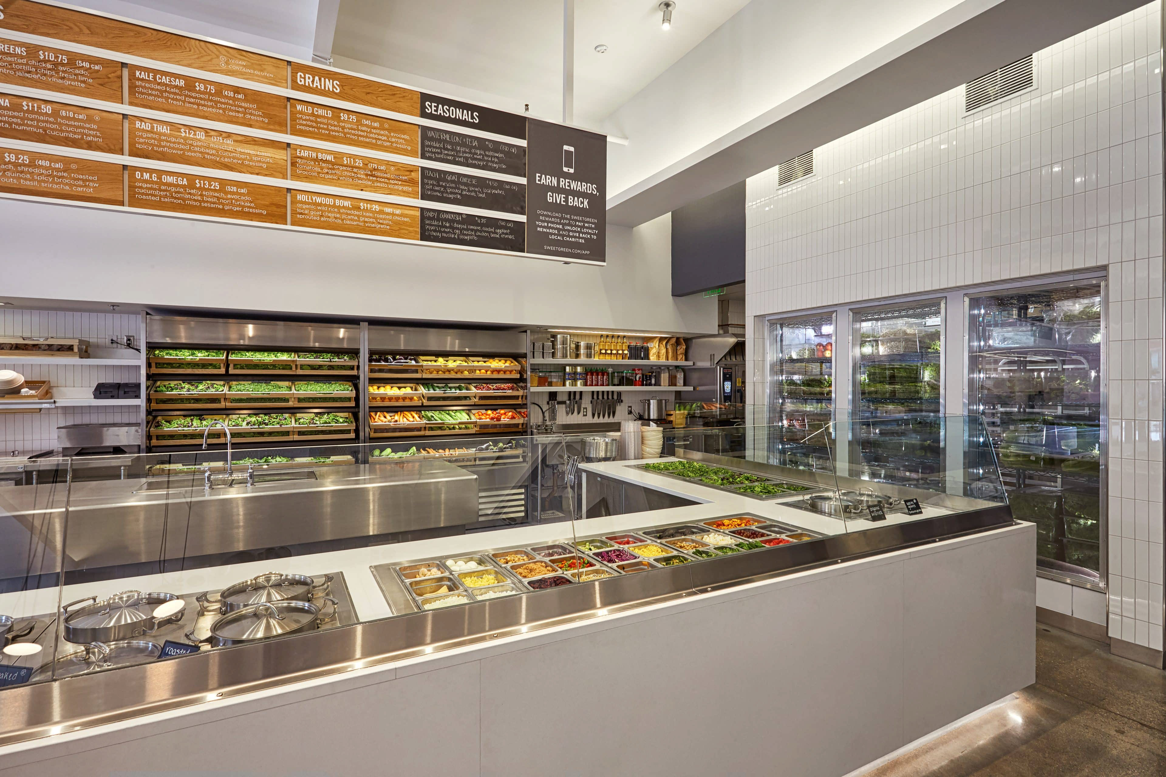
Photographic References
Color Palette
Iconography & Text
Bringing it all Together
Type, color, and graphic imagery are all key parts of a brand's identity, and all those elements needed to carry the same feel and message established at the onset of this project. Robust, playful, and modern.
Type Treatments
Patterns
Exploring Advertising
In making print ads the focus became making sure the unique selling point came across in a way that was informative and visually seducing - the goal being to give the casual onlooker a smile in the mind and make them engage with the product.
The result from this stage were two visual-centric advertisements and two type-centric ads, exploring how the two different mediums can be used to the same effect.
Visual-Dominant Advertisements
Text-Dominant Advertisements
The Fun Stuff
This project reached its apex with the process of producing different collateral for this brand to be used practically in a restaurant setting. Menus, coasters, drink tags, to-go boxes, and juice boxes, were a few of the pieces of collateral I produced using the brand elements I had already established.
Flat Collateral
3D Collateral
Talking About the Bread Box
My favorite thing to come out of this project was the bread box. It was a challenge to design something different from the field of boxes that exist but still practical and functional. Through countless iterations, I eventually arrived at the idea of a bread-shaped box that reflected the toast that you would receive inside of it.
